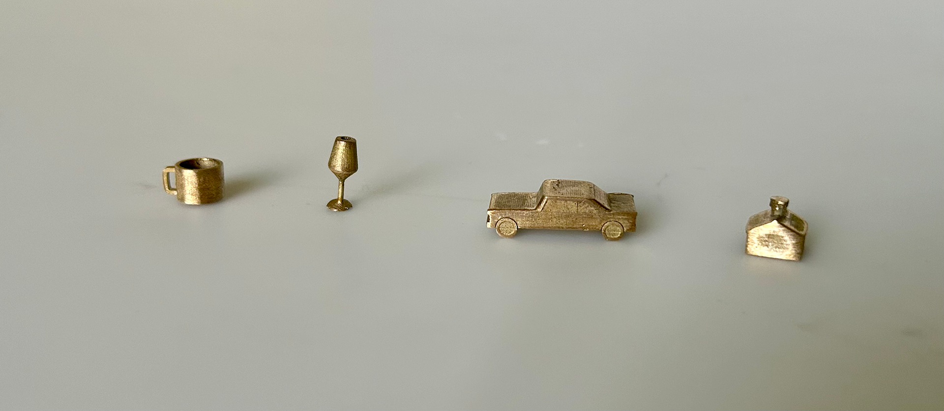
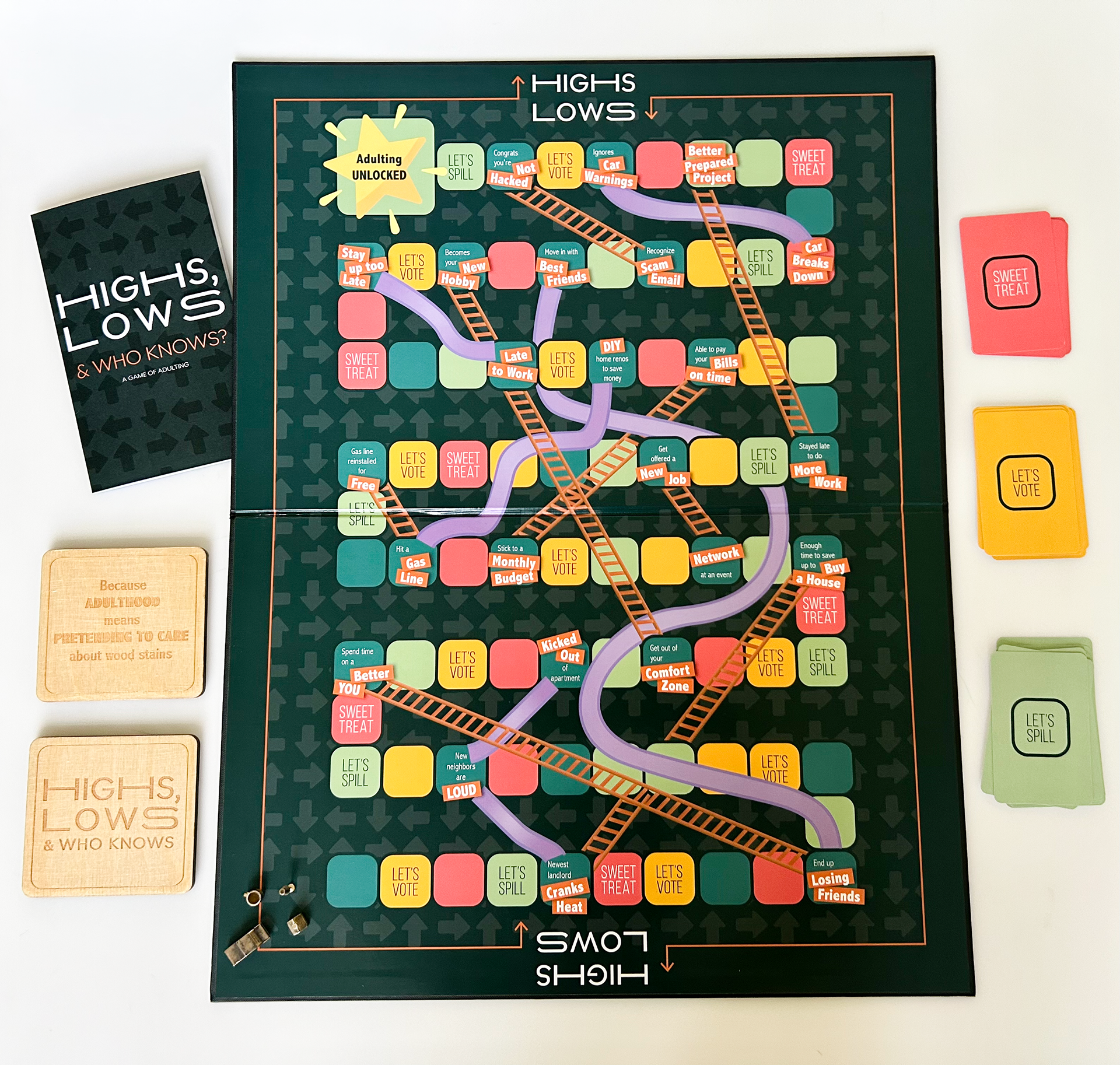
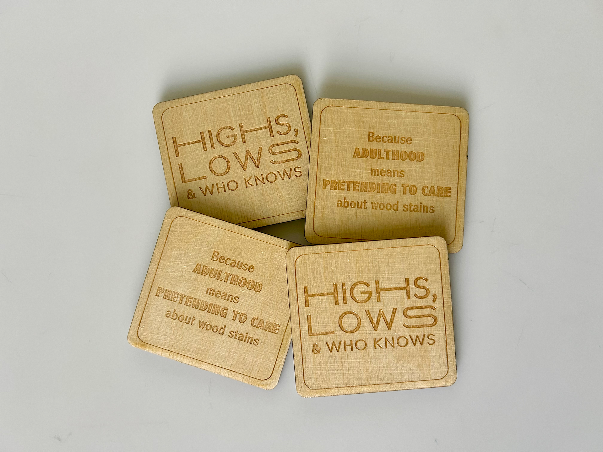
This interactive board game is an adult version of Chutes and Ladders that fosters laughter, conversation, and reflection. Just like life, there are ups and downs, but who knows? The game holds a di-fold board, a direction manual, 3 decks of cards, 4 woodcut coasters, and 4 bronze game pieces made with the help of 3D renderings.
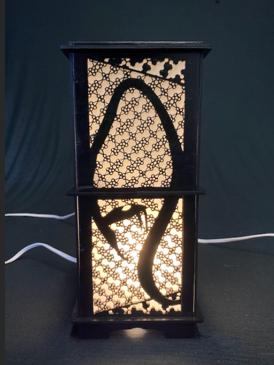
Laser Cut Coasters
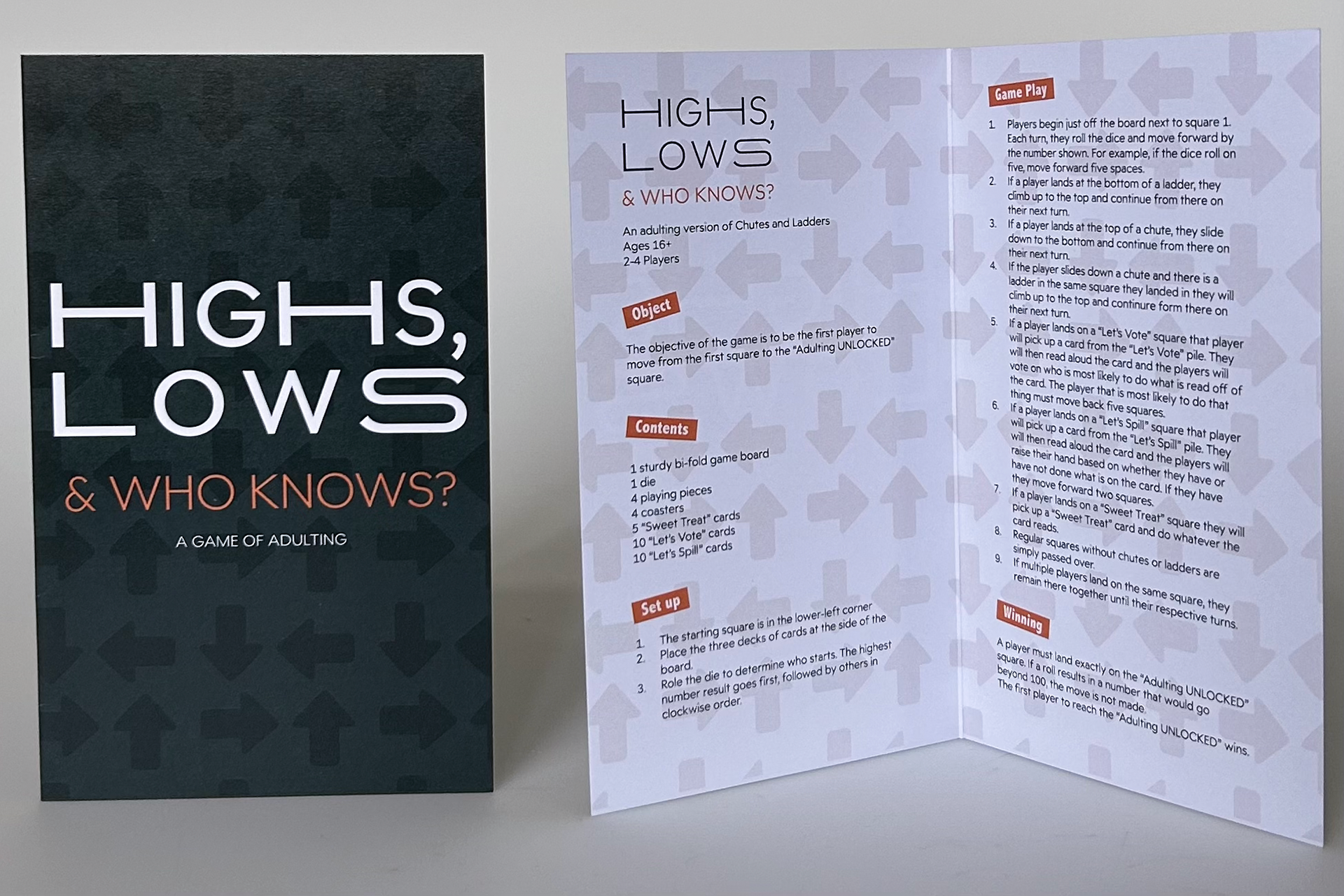
The Instructions